Dear Examiner,
In the progress of constructing my magazine I have developed skills and knowledge that I will be able to develop and use in the future. I have very much enjoyed every part of this process especially being able to develop a better understanding of Photoshop which has enables me to create an eye catching product. I hope you enjoy looking through each of the stages of profession leading towards my final product.
Thank you,
Ceri lewis.
Thursday, 30 March 2017
Wednesday, 29 March 2017


Tuesday, 28 March 2017


Monday, 27 March 2017

Sunday, 26 March 2017

Friday, 24 March 2017

Thursday, 23 March 2017
Wednesday, 22 March 2017

Monday, 20 March 2017
Sunday, 19 March 2017


Friday, 17 March 2017


Thursday, 16 March 2017

Thursday, 16 February 2017


Monday, 13 February 2017
Update Post:
This week I am planning on re-taking some of my images. I feel that my double page images work well so I will not be re taking these but I feel my cover page image is not appropriate for my image. As quoted from my audience feedback, the model's face is too "innocent" and I have been given feedback to "use a more impacting image with the lipstick being even brighter" so I will do this. I am going to use a model with blonde hair and I am changing her outfit to wearing a denim jacket (as shown in my alternative rock fashion research). I am also going to be taking pictures of a male model as it means my magazine will be more appealing to both genders maximising the amount of publicity I will get overall.
Sunday, 12 February 2017
Draft magazine audience feedback
Eva Maddison (16 year old female)
Front Cover:
I think the cover page looks good apart from I feel there are too many artist names on the side which means the amount of writing takes too much attention up on the cover. The colours go together really well and I like the use of red lipstick but I am not sure whether the photo is suited to the type of magazine as I think the face looks too innocent for an alternative rock magazine.
Contents Page:
The font looks good and it is laid out clearly but I feel it may be worth swapping the image on the left as to me i don't feel it suits the magazine. Focusing on smaller factors, the 27 on the photo on the right is a little too far to the edge of the photo but that can be easily changed. Overall it looks good but can look even better with a few small adjustments.
Double Page Spread:
I feel this double page spread looks really good and all of the colours work well together but there are a few things you could change. The image could be brighter and have the text stand out to make the artist stand out more. You could change the smaller images and then make it brighter as I think the images are too similar and the page will look better as a whole by having some variation. 'Fireside' could be a different colour to stand out but the layout of the article overall is easy to understand and read through.
Stephanie Colderick: (17 year old female)
Front Cover:
Front Cover:
I think the cover page looks good apart from I feel there are too many artist names on the side which means the amount of writing takes too much attention up on the cover. The colours go together really well and I like the use of red lipstick but I am not sure whether the photo is suited to the type of magazine as I think the face looks too innocent for an alternative rock magazine.
Contents Page:
The font looks good and it is laid out clearly but I feel it may be worth swapping the image on the left as to me i don't feel it suits the magazine. Focusing on smaller factors, the 27 on the photo on the right is a little too far to the edge of the photo but that can be easily changed. Overall it looks good but can look even better with a few small adjustments.
Double Page Spread:
I feel this double page spread looks really good and all of the colours work well together but there are a few things you could change. The image could be brighter and have the text stand out to make the artist stand out more. You could change the smaller images and then make it brighter as I think the images are too similar and the page will look better as a whole by having some variation. 'Fireside' could be a different colour to stand out but the layout of the article overall is easy to understand and read through.
Stephanie Colderick: (17 year old female)
Front Cover:
The font for the masthead “Diverge” is very effective and works really well against the white to attract audiences to your magazine. The use of the colour red is also very good on this page which allows for a link be to created across your magazine. The font used is also effective in showing that this is a magazine cover page and the white border for the image is also a sleek and professional design. I like the information layout you have under the masthead and how this is in a smaller font to rest of the information. By doing this you able to indicate to the audience what the more important information is which is key feature of a cover page. The direct address of the artist looking directly at audience by using a close up shot is also very effective as is the image being a professional and well taken image. To improve the image you could maybe use a more impacting image with the lipstick being even brighter and more of a key feature.
Contents Page:
I really like the use of the colour red as this makes the page look interesting and engaging to read. The less excessive use of the red colour is very effective as I believe had you used the colour more this could look overpowering to the reader. The text is well organised on the page and is interesting and engaging to read. I would suggest maybe using another colour or a slightly different font size to differentiate from the mini heading of each page number to the description. The images are well chosen, particularly the full sized image for the band as this fits the space very well. I really like how the page number is in its own box as gives your magazine its own little quirk. Using the word “Features” is also a very sophisticated and professional technique.
Double Page Spread:
The images are very effective as the group girls together give the impression of being a real band, as well as the image itself being good quality and well taken. The black and white colour scheme is sleek and professional as well as following the conventions of your magazine genre. I really like the line under the title and the pull quote as I feel this is effective and definitely pulls readers into the article. The text under the image also looks very professional giving the page a genuine feel. The smaller image is impacting however perhaps not using a full body shot would also work as the space for the image is quite small and closer shot may make more use of the space. I really like the faint lines between the columns of text as this pulls the page together, and neatly but subtly organises and arranges the text for the audience well. To improve I would suggest adding slightly more colour to page, maybe via text and making the text slightly smaller to stick to magazine conventions more.
Amy Bradley: (16 year old female)
Front Cover:
I really enjoy the specific font you have used for your title as I feel that it really compliments your page as a front cover. Another element I really enjoy is the colour scheme you have decided to use as you have been fluent with using these particular colours, they really work alongside your magazine. The red really helps highlight important information, however I do believe that the artists name needs to be raised from the bottom of your page a little bit. You can really see who your target audience is from the way you have dressed your model, the colours you have used and the way you have presented your magazine in relation to other alternative rock magazines.
Contents Page:
I like the way you have chosen to illustrate your magazines contents page as it appears very professional, and the way you have displayed your text is easy to follow which is another benefit. One of the only bits of criticism I have is that I'm not sure the exclamation marks work within your text as it may come across as 'cheesy'. However, I think your choice of font is lovely and finishes this page nicely. Your photographs are intriguing, but I am unsure if the picture on the left of your contents page feels slightly out of place. Other than that the costume and make-up you have done on these models really fits your theme.
Double page spread:
Your layout really resembles a real magazine which shows that your research has been successful. Your photographs also really give the sense of a real band due to the way they are so close and the way that they are dressed. Although the photograph could be slightly smaller so that your website address isn't so small and doesn't appear squashed. I also believe that the size and style of your font is acceptable.
Saturday, 11 February 2017
Teacher Feedback Response- Draft Magazine
Front Cover:
Looking at the feedback from my teacher he has only recommended to move my barcode but looking at my audience feedback I am continuing my decision to change my main image as I feel I can have a better framed image that will attract my target audience more.
Contents Page:
For my contents page, I have been told to brighten my images, make my text smaller and to change my page number. I will take on board this feedback ensuring my magazine looks as effective and realistic as possible but I am also going to change my image on the left to a male model image as this ensures my magazine will stand out to my target audience (50% male 50% female).
Double Page Spread:
I have been asked to change my title so it isn't just the band name and looking at various double page spreads I can see the variations of headings which I will decide upon in the future ensuring it relates to my artist name. I need to make my writer and photographer credit text smaller to ensure that it doesn't take the attention away from my artist image as well as making that image bigger and brighter. I am going to change my smaller image as I can now see it doesn't work with the styling of my magazine so I think I am going to change it to an image of them all sitting down which could be a symbolic meaning of how they started low in their career but are building themselves up. I have been given assurance by my teacher that it is a good idea which shows my magazine will attract my target audience as it will be intriguing.
Friday, 10 February 2017


Audience Feedback Response- Drafts
Front Cover:
I have been told that my colours and title work really well which assures me that they will stand out to my target audience along side the font I chose which tells me that I do not need to change any of these aspects. I have been suggested to change my image having brighter lipstick which is a feature I was considering anyway as I didn't feel it suited with my genre and target audience and I can see from my audience feedback that they also agree with this. I have had the suggestion to have less text on the side which I will take on board as I understand it looks very crowded so I may space the text out more so my front cover is more appealing to the audience.
Contents Page:
I have had the suggestion from two feedback responses to change my image on the left which I am going to do to a male model who is 17 years old and I feel he will work with the magazine style I want. This ensures that my target audience of 50% male and 50% female will be interested in my magazine. I have been told that my colours work well together and my font is good so I will not change either of these. I am going to make a few minor adjustments when I have my teacher feedback ensuring my magazine is as attractive and eye catching as possible.
Double Page Spread:
I only need to make a few minor adjustments for my double page spread brightening the image, moving it slightly and swapping the image in the article. I will look at my teacher response before I make any improvements.
Thursday, 9 February 2017
Draft Magazine next to flat plans


Looking at the comparison of my flat plans compared to my draft magazines, I can see I closely kept to the design of it due to the positive feedback on my layout for my audience feedback on the flat plans. Overall I am happy with how they have turned out and I will look at my teacher and audience feedback on my drafts to develop my media product for my final design.
Wednesday, 8 February 2017


Monday, 6 February 2017

Saturday, 4 February 2017

Thursday, 2 February 2017
Tuesday, 31 January 2017


Monday, 23 January 2017
Update Post:
This week I am going to begin constructing my draft magazine closely following my flat plans and referencing the conventions and techniques used in a real magazine product to ensure my magazine stands out to my target audience.
Wednesday, 18 January 2017
Red Lipstick
I chose to have my model wearing red lipstick in my magazine as not only does it stand out and make the magazine look eye catching, Dark Red lipstick was popular in the 1920s and was worn by Flappers to symbolise their independence. Furthermore in the 1930s, lipstick was seen as a symbol of adult sexuality and teenage girls saw it as a symbol of womanhood whereas adults saw it as an adult of rebellion as they did not believe that teenage girls should be wearing lipstick. This is a connotation for my genre of alternative rock as I believe the lipstick is symbolic of free will and independence- clearly shown in the Leading Edge Tribe for the Scenesters group for my target audience. I feel that the symbolism will attract my target audience and encourage them to buy my magazine.
Positioning
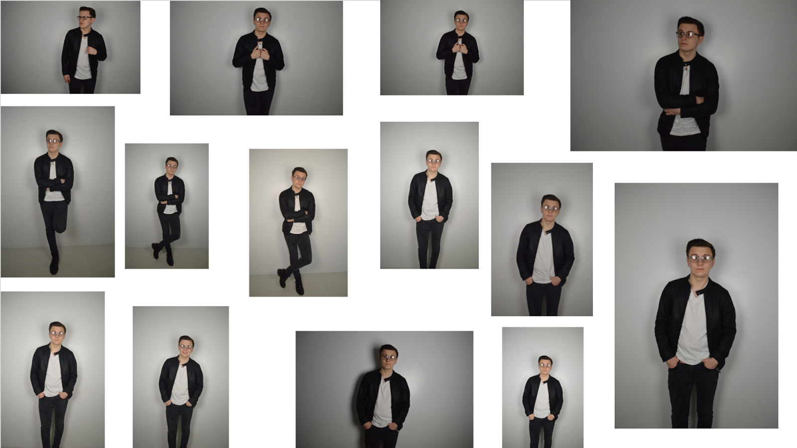
For my images, I did a variety of shots to ensure my magazine images will have an impact on the audience. I did a variety of close up shots for my front cover as this is the shot conventionally used in magazines as it means the artist will have a more significant influence on the audience ensuring they will remember her. I had my contents artist on the floor mainly to have a different shot perspective so she stands out in comparison to my other artist image of my group all standing up. My double page spread group photos feature a selection of shots which I will chose between depending on the layout of my double page spread and seeing which image I feel will stand out the most and work with the article.


Tuesday, 17 January 2017


Photo Preparation:
In the build up for my photos, I have asked the model in my front cover to wear red lipstick and a black top to ensure the text will be seen over it. My contents page model will be wearing dark clothing to work with my magazine styling and my group artist are wearing dark clothes such as grey and black which works with my other images and the styling of my magazine. They will also all be wearing the same lipstick which will be a subtle yet effective way of bringing them all together as a group. All of my outfit inspiration was taken from my fashion research to ensure the images will attract my target audience.
Audience Feedback Response- Flat Plans
Front Cover:
I can see that my three audience feedback responses have told me that the colours will work together and the use of red lipstick is a good idea as it will show the link across the magazine. I have received compliments on my layout which has told me as I have no criticism on this matter I will continue with the layout I have decided on and see the feedback I get in my draft work. The only criticism I have is to possibly turn the barcode horizontally but I don't think this will work with my layout so I will see the feedback I get on my draft using my currently layout.
Contents Page:
I have been given feedback saying that my simplistic layout and continued colour scheme is good which has assured me that they work as I was questioning whether my magazine lacked originality as each page linked together but a main focus on each feedback response says how it is good how they all work together. My layout has been described as "organised" which is a key feature in a contents page which ensures that my reader will easily be able to understand the format of the magazine.
Double Page Spread:
I have received comments that my layout is good with the columns as it will draw the reader in more which is shown in one of my responses saying that they "will only read the articles that seem like they have little writing as I get bored easily". This has shown me that already my magazine will appeal to my target audience of 16-24 year olds and this feedback response is 16 years old which shows my magazine will stand out. I have been told to ensure my text in the article ins't too small and to use a heading underneath the Fireside title which I also agree with but did not consider in the construction of my flat plans. This means I can use my feedback to develop my magazine in order to attract my target audience.
Flat plan audience feedback
Eva Maddison: (16 year old female)
Front Cover Flat plan:
I really like the colour ideas for this flat plan as I can tell that they are contrasting colours which will make the writing stand out. I think the layout is good as it looks professional and works well as a whole and I can see that it would work well on a shelf with other magazines. I think the title of 'Diverge' is really interesting and unique and I have heard the term before so I understand what the meaning behind the title is and I think it works so well with your genre! I think if you stick to this layout and pick a font that works with your magazine I think it'll look really good overall!
Contents Page Flat plan:
I think it's good how the colour ideas are similar to the front cover so you can tell they are related as well as hopefully working well together to create an attractive product. It is a nice layout as it is very organised which means it is easy to read and understand.
Double Page Spread Flat plan:
I really do like the title Fireside on this double page spread as it is eye catching and suits the genre and will look good on the magazine as a whole. I do like the layout and I like how the writing in the article is split up as to me as a reader I generally will only read the articles that seem like they have little writing as I get bored easily otherwise. I also like how there is information on the bottom of the main image about the magazine as it fills the space and will look good.
Stephanie Colderick: (17 year old female)
Front Cover Flat plan:
Front Cover Flat plan:
I really like the colour ideas for this flat plan as I can tell that they are contrasting colours which will make the writing stand out. I think the layout is good as it looks professional and works well as a whole and I can see that it would work well on a shelf with other magazines. I think the title of 'Diverge' is really interesting and unique and I have heard the term before so I understand what the meaning behind the title is and I think it works so well with your genre! I think if you stick to this layout and pick a font that works with your magazine I think it'll look really good overall!
Contents Page Flat plan:
I think it's good how the colour ideas are similar to the front cover so you can tell they are related as well as hopefully working well together to create an attractive product. It is a nice layout as it is very organised which means it is easy to read and understand.
Double Page Spread Flat plan:
I really do like the title Fireside on this double page spread as it is eye catching and suits the genre and will look good on the magazine as a whole. I do like the layout and I like how the writing in the article is split up as to me as a reader I generally will only read the articles that seem like they have little writing as I get bored easily otherwise. I also like how there is information on the bottom of the main image about the magazine as it fills the space and will look good.
Stephanie Colderick: (17 year old female)
Front Cover Flat plan:
The name Diverge is a really cool and quirky name and by having this is as black text against a white background will really help the text to stand out and be eye catching on the cover. I really like the idea of using a close up shot as this will create a direct link to the audience and make the magazine look engaging on the shelf. The red lipstick will also be a key feature point and link in very well with the red text. You have also covered the key conventions of magazine via your cover page by having the barcode which will make your magazine look realistic.
Contents Page Flat plan:
The layout of different boxes for the contents page is a great idea as this will easily sort the text for audiences and help the contents page look reader friendly and interesting. By featuring your double page artist this will create a link through your magazine which will make the magazine look like a realistic magazine. I like how you have linked your ideas and inspiration to real magazines on your flat plan as this clearly shows how your magazine will look realistic.
Double Page Spread Flat plan:
I really like how the title is across the top of the page as this tells me clearly who the article is going to be about and lays out the rest of the page clearly; however, a different title would also work well to be more creative and to draw people into the article more. I think the idea of using a pull quote is a good idea and would definitely attract me to read the rest of the article. By having the text in columns the text looks more appealing to read and a lot more reader friendly. I like the idea of having an image within the article however I would suggest that you don’t make this image too small as this will lose the effect and impact. I really like the idea of a having an image take up the right hand side page as this will place empathise on the band and pull the double page together.
Amy Bradley: (16 year old female)
Front Cover Flat plan:
Your front covers title is very enticing and I can imagine that the title with black font would really stand out amongst the white background which is perfect for catching your audiences attention. Your ideas about the make up of your model is very well thought through and would definitely attract your specific target audience. I also believe that the audience you are trying to attract here is easily known through your use of colours of black, red and white. Yet again, your front covers use of colours and simplistic layout goes exceptionally nicely with the rest of your ideas for your magazine. The only slight bit of criticism is that I believe the barcode could be positioned horizontally.
Contents Page Flat plan:
I love the way you have decided to portray your contents page- despite the fact that you have used a simple layout design it's really effective and I can see some really good potential for this as your contents page. I also like how you have differenciated the differences in the colours of the headings and numbers as this gives a very sophisticated and smart feel to your magazine. The originality of your magazine follows the rest of your ideas which is what I really adore, the way in which your magazine flows. The white border around your page really compliments the rest of this page and you can see that you have really thought out your ideas.
Double Page Spread Flat plan:
I like the way in which you have positioned your band name 'Fireside' in large and bold text as it's very eye catching for an audience member. Although, maybe having a catchy subtitle in large font then having the bands name underneath it would look nice. I personally enjoy the way you have structured there layout of your article as I believe it would be very easy to read. It is clear to see where you have got your inspiration from other magazines from yet your magazine is still very individual due it its unique band name and other elements. I also love how you have displayed one image as the main focus on this page as it will allow the audience to concentrate on the information about the band members rather than lots of photos. You have clearly done lots of research into other magazines as this shows in your structured layout of your double page spread. The way you have decided to put a website address at the bottom of the photo is also a good idea as it appears as a good form of advertsing.
Monday, 16 January 2017


Subscribe to:
Comments (Atom)
-
Dear Examiner, In the progress of constructing my magazine I have developed skills and knowledge that I will be able to develop and use in...
